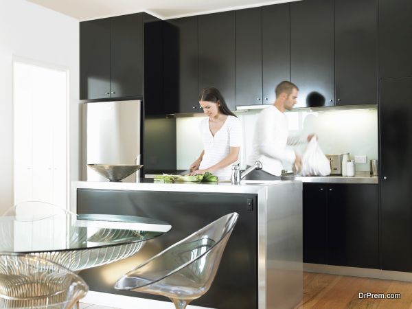

Giving your bathroom some TLC should definitely be on the agenda this spring. Whether it’s a spruce up with a coat of paint and a refresh of accessories, or a full bathroom remodel, the bathroom is a good place to start when you get the urge for a spring clean and an overhaul.
Bathrooms are tricky rooms to get right. You can’t just change the fixtures when you get bored of them (well you can, but that would be a costly and quite frankly wasteful exercise). Tiles are difficult to change on a whim too, which is why colour choices are often very tentative in the bathroom.
White tiles, white bathroom suites and a splash of colour on non-tiled walls are often the go-to formula for many bathrooms. Often the smallest room in the house, we feel compelled to stick to white and light colours in a bid to make the bathroom look bigger and brighter. But, it doesn’t have to be like that.
When it comes to bathroom décor, some colours are not for the faint-hearted, but they definitely shouldn’t be ruled out. If you can’t face bold, even muted spring colours have appeal and add timeless elegance and a bit of joy to the prim white bathroom.
Here, Dakota Murphey gives you some of 2017’s bathroom colour trends to get your bathroom project underway:
Lavender
This chic soft purple will bring some colour to the walls in your all-white bathroom. Lavender coloured walls or furnishings work well with a white bathroom suite. Lavender also works fabulously with grey and is the perfect pairing for grey and white marble. The Brighton Bathroom Company has paired these colours beautifully in one of their high-end bathroom designs. You can take a peek for inspiration on their East Sussex page.
Delicate Pastels
The Ideal Home Magazine predicts delicate pastels as a bathroom colour trend for 2017. Pale blue is a bathroom favourite and is a really calming colour. It looks really effective in shaker-style bathrooms giving a truly traditional period-style ambience.
Peach and rose are timeless colours that create warm shadows. It’s also a colour scheme that works well for putting make-up on. Rose is the ‘in’ hair colour in the world of fashion and it’s just as beautiful in the bathroom. Yellow and Green incidentally are unflattering to the skin, so avoid putting make-up on around these colours. They distort your skin tone so it’s easy to apply too much of the wrong colour.
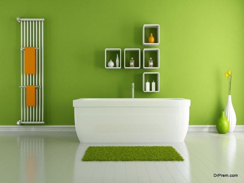
Botanic Greens
Well we know we just mentioned greens not being good for skin tones and applying make-up, but there are mirrors elsewhere in your home. We can’t ignore the fact that botanic greens are making a big splash in the bathroom. According to the Aussie Vogue Living magazine, Pantone’s big colour predictions for 2017 include kale (an earthy green) and hazelnut, as well as rose quartz. Botanic greens are being subtly introduced to bathrooms by way of plants, towels and tiles. Timber-look tiles (hazelnut!) are also trending and complement botanic greens perfectly.
Warm Chocolate
Dark chocolate coloured wooden bathroom furnishings and a wood-clad built in bath, combined with lighter walls and creamy white window frames and doors will bring brown tones, warmth and style to the bathroom. Teal works surprisingly well with chocolate colours (walls, blinds or accessories).
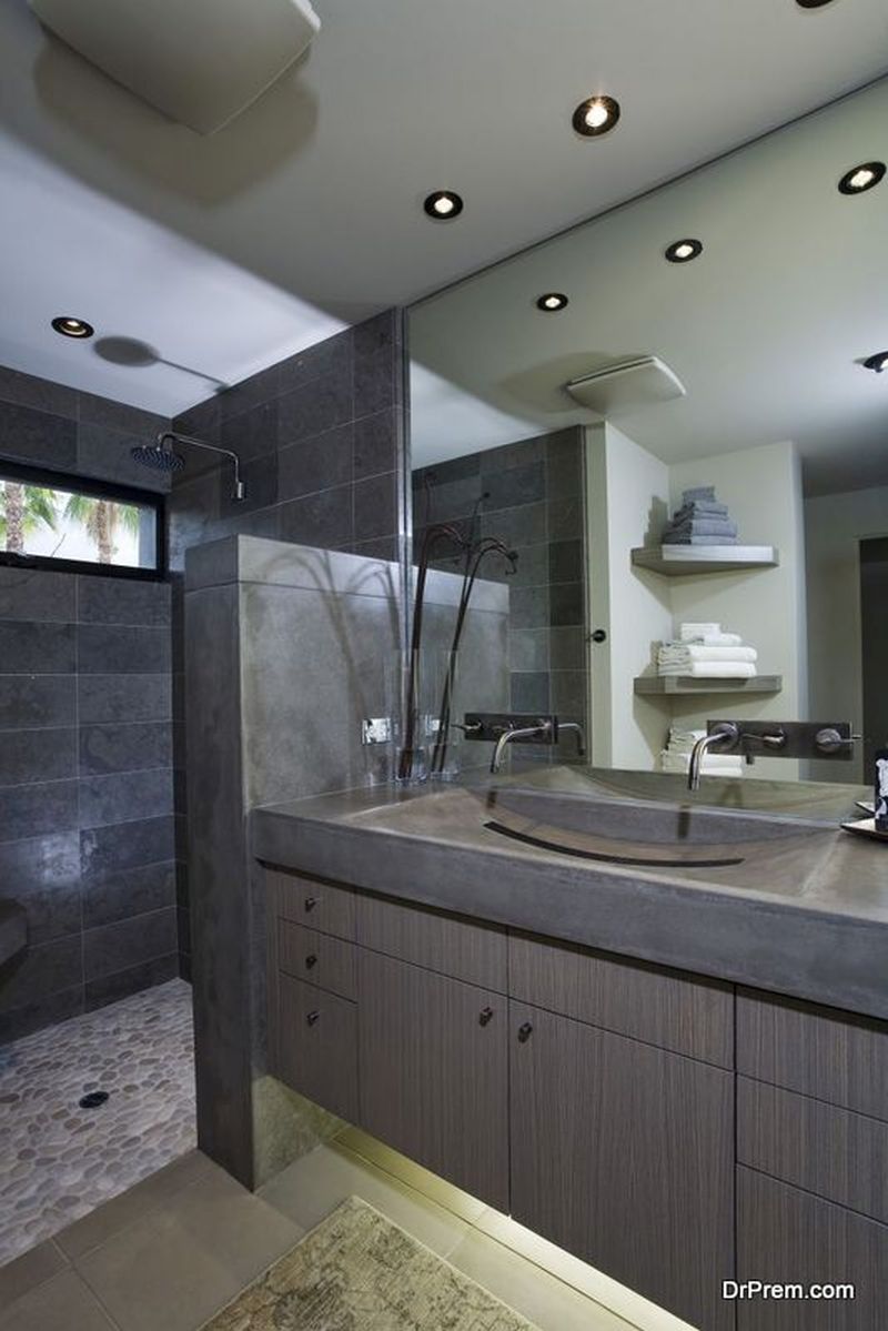
Charcoal
Grey is still trending in home décor and it looks set to stay, so you’ll be safe adding some timeless elegance to your bathroom. Against a white bathroom suite, charcoal grey makes a dramatic statement, and teams well with antique green accessories (blinds and towels).
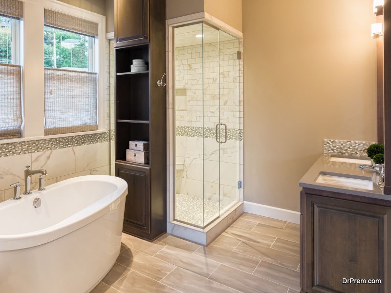
The Neutrals
The neutrals never really go out of fashion. They come and go in varying degrees, even if only paired up with their brighter cousins.
Pewter and ivory are neutral colours that veer away from stark white, which can sometimes be a little harsh. Softly coloured neutrals bring warmth into the bathroom and are very soothing. If you are trying to create a bathroom with the feel of a spa, then neutrals and muted warm tones not only look stylish, they will help you to feel relaxed. It’s the go-to choice if you really can’t stomach the idea of bright and bold colours.
A pop of bold
Small rooms, especially cloakrooms and tiny bathrooms are unexplainably given a wide berth when it comes to bright, bold and daring colours. We mistakenly try to make them look bigger and brighter with lighter colours when there’s no need to. They are functional rooms. We don’t need to give the illusion that we can entertain 20 people in them.
We love the Farrow and Ball Brinjal paint colour. Don your bathroom walls with as much of it as you dare. Farrow and Ball’s Pelt paint colour looks fabulous on the underside of a freestanding bath. It’s a sophisticated colour choice and a compromise if you can’t bring yourself to make a bold statement with colour on the walls.
Be brave, be bold and love your new bathroom.
Article Submitted By Community Writer